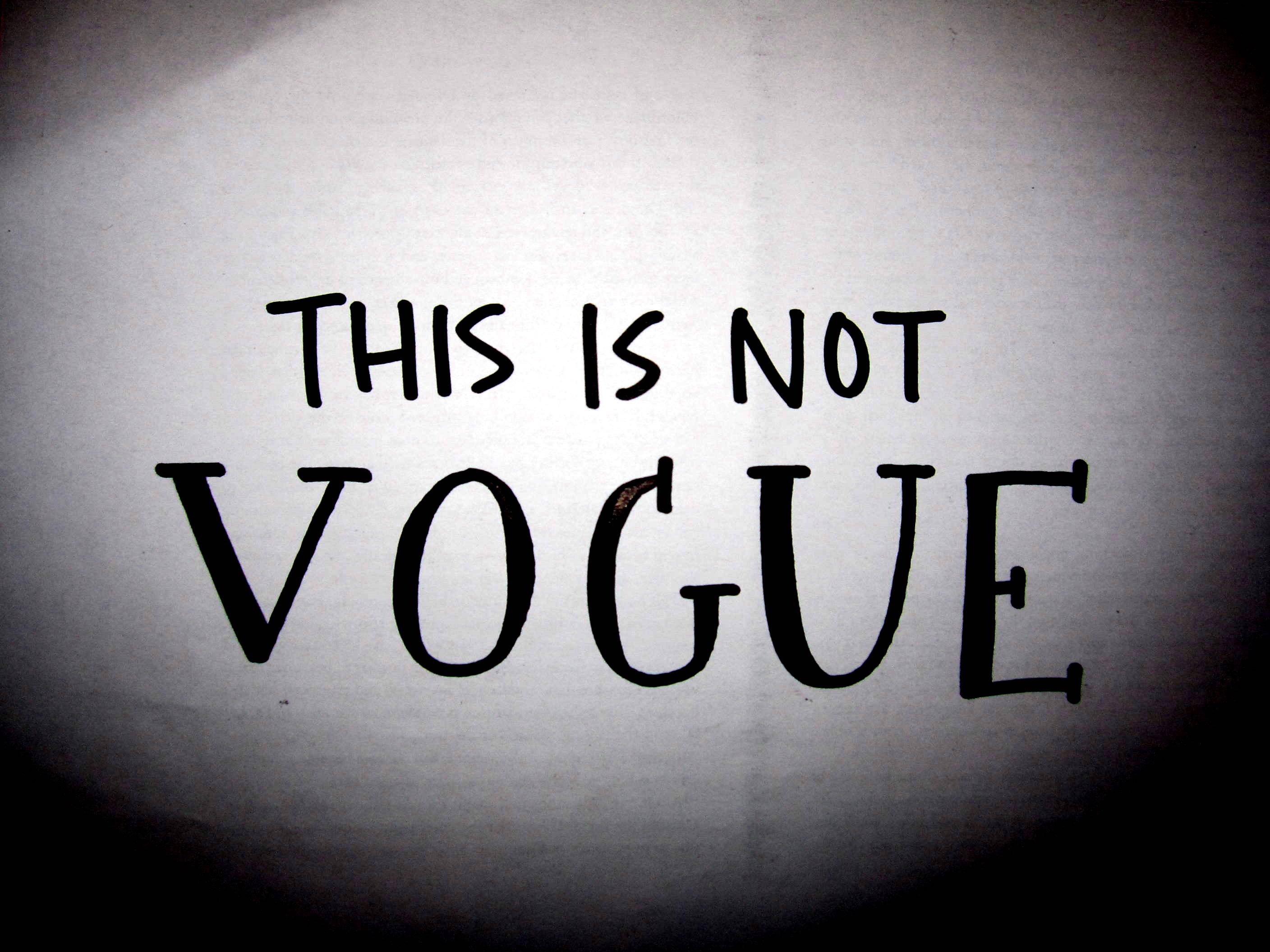
 Fashion and aesthetic are intrinsically linked, so a discussion about the website design of This Is Not Vogue actually slots perfectly well in amongst this little blog’s chatter of clothes, shopping, designers, and the rest. Like fashion, website design is based on the notion of “cool” and what makes and defines this enigmatic idea.
So, what exactly is “cool” – on the web, on the street or anywhere?
[Forgive the digression here, but when I reached this point whilst writing this I had a burning desire to play Outkast’s Hey Ya – “What’s cooler than being cool?! ICE COLD.” So, for those of you who feel the same way click here: watch, listen and then continue reading…]
Author of The Laws of Cool, Alan Liu has argued that what’s “cool” in web design is to be minimalist. To interpret this in very simple fashion terms – think minimalism a la Calvin Klein or Rick Owens or Ann Demeulemeester – the expertly crafted, stark, black + white look. Cool design on the Web imitates the “look and feel” of the minimalist graphic design which stems from the original avant-garde movement of the 1920s. Much like avant-garde fashion design, wouldn’t you agree?
This current era of web-design “cool” spawned in part from a back-lash to the personal home-pages of the 90s and their distinctively amateur layout choices. Many web designers despise “amateur aesthetics” in much the same way as a fashion designer wouldn’t go out of their way to replicate clothing designs from K-Mart or the like.
What then is “uncool”?
 As Vincent Flanders and Michael Willis have said in their book Web Pages That Suck, the websites which generally “suck” are those which are OTT; cluttered with graphics, inconsistent fonts, and background images. Their lesson: “Cool is only cool if “fitted” into a functionally clear, total design.” There’s no better way to illustrate the amateur OTT fad than via the “pimping” of MySpace profiles with glitter graphics, backgrounds and multiple moving images – resulting in a busy, ugly mess of a web-page. For arguments sake, the pair of Baby Phat jeans (left) represents amateur, glittery web design and the outfit by Calvin Klein (above) represents the minimalist idea.
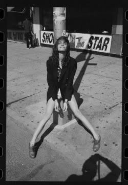
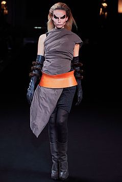
But even though minimalism is the “cool” for web-design, there is always a backlash movement. Enter: anti-design. This idea began in 1960s Italy as a direct contrast to the minimalist impulse. It went against what was widely regarded as “good design” and instead distorted elements of form, colour and balance to create something completely novel. That’s not to say that those Baby Phat jeans or MySpace glitter graphics are now appealing, but rather it opens the door to other forms of cool. With careful construction and consideration of the overall idea, elements of traditional “anti-design” can be infused to aspects of “minimalism” to create something completely original. This is true of web design and fashion design – look no further than Aussie label Romance Was Born and the designs of the late, great Alexander McQueen (below). They both are definitely of the “maximal” school of design, but in a very aesthetic and knowledgeable way.
Where does this leave me and my blog?
I now know the rules of “cool” and so have hopefully fooled people into thinking I’m not a complete amateur in the web-design game. Alas, I’m not a professional web-designer so I chose to err on the side of caution and adhere primarily to the Minimalist Impulse.
Of course, it must be noted that using the WordPress platform is a double edged sword – although everything is easy to use, you must conform to relatively rigid templates. I chose the Inuit Types theme because out of all the layout options this one provided an original look whilst still remaining sleek – both with the black and white colour format and the use of the cube design for all the posts and widgets. Like other blogs in my niche, the minimalist page layout is offset with colourful pictures – which add interest but don’t distract from the simple design. I tried to capitalise on this aspect because it was one of the few ways I could actually get creative with the layout.
 Although I wasn’t able to change any of the fonts (no need to enter into the Comic Sans debate!), I was able to add a bit of individuality through widgets. The biggest stylistic choice in terms of widgets was through adding an image linked to a post below the main title text – once again, photographs are at the crux of all fashion blogs. Similarly, I chose to incorporate a couple more images in the side bar as well as the standard blog-roll, tag cloud and category search function. I like to think that whilst my blog could hold its own visually amongst the others in its niche, it is still a strong reflection of my own aesthetic choices.
So whilst the “minimalist” fashion look reached its peak cool-ness in the 90s and is today maintained by a select crop of skilled designers…


Web Design Milano
June 2, 2010
Milan based Web Marketing company offering wide range of services including Web Designing, Internet Marketing – SEO, PPC and SMO at cost effective price.
mysecretbakery
June 4, 2010
terrific design layout choice! Love the color palettes love the language love the feel of the blog!:)